11 designer details for kitchen remodels


Designers have many secrets they deploy for a successful kitchen remodel. Recently Barbra Bright from Houzz shared 17 of her favorites, and here are 11 more. Read on for ideas that will make your kitchen more beautiful as well as more functional.
Note: The following is a guest contribution from Houzz, a leading platform for home remodeling and design.
Before we get started, here’s a bonus piece of advice: I highly recommend you invest your dollars in the best cabinetry you can afford, and worry about the appliances later. In other words, don’t sacrifice the quality of your cabinets for new appliances if budget is an issue. Instead, delay purchasing your [client’s] dream appliances. Why? Long after [your client has] replaced [the] refrigerator and dishwasher, the cabinets will be standing, and they are the foundation for a beautiful kitchen.
Now, onto more details that make a difference.
Refrigerator side panel
Most kitchen remodels incorporate the refrigerator into the design by adding side panels that match the cabinetry for a built-in look. Standard countertops overhang base cabinet doors by half an inch. Be sure the depth of the refrigerator panel is slightly greater than the depth of the counter. Otherwise, the counter will jut past the panel instead of converging with it.
Tall cabinets
In addition to increasing the depth of the refrigerator panel, also increase the depth of your tall cabinets as shown here.
Consistency is the key to good design, therefore all counters should have the same reveal, or edge configuration.
Flush countertop
Not all countertops overhang the doors by a half-inch. Some clients prefer their counters flush with the doors and drawers for a modern, streamlined appearance.
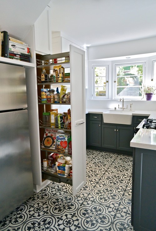
Pantry pullouts
Pullout cabinets should be only 9, 12 or 15 inches wide, in my opinion.
Why? By virtue of the pullout’s design, every time you need a can of soup, you experience the full weight of everything that’s stored there.
A wider pantry pullout is simply too heavy.
Pantry with rollouts
For pantry cabinets wider than 15 inches, I prefer rollouts. That means you’re pulling out only the shelf you need, not the whole pantry.
Also, consider the projection of the hardware of any cabinet next to the wall.
Make the filler (a matching strip of wood that fills the gap between the cabinet and wall) at least 1.5 inches wide to keep the hardware from hitting the wall and possibly restricting the usability of a cabinet with a rollout.
Oils and sauces
Kitchens are all about function. I always try to put at least one pullout for frequently used oils and sauces next to the range.
Although some worry that the heat from the range may turn the oils, most ranges have great insulation.
That, coupled with the thickness of the cabinet’s sides, means sauces and oils rarely spoil.
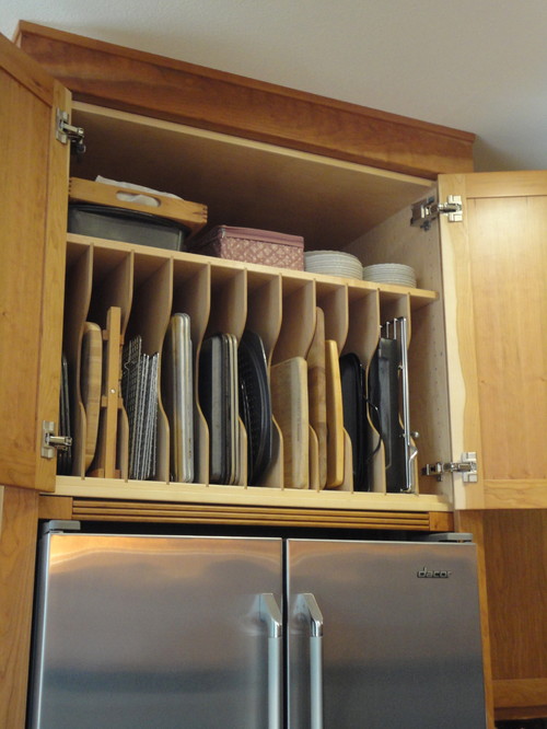
Shelf above tray storage
Some clients don’t need tall tray storage because their trays aren’t that wide or they store them on their sides, as shown here.
If this is the case for you, consider adding a shelf above the trays for extra storage.
Lack of trays
Not everyone needs an abundance of tray storage. For those clients, I will add a partition to the cabinet and adjustable shelves to the other side.
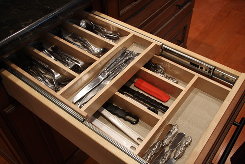
Double cutlery
For years I specified a single-layer cutlery holder for my clients. Now, I include a two-tiered insert to double their amount of cutlery storage.
Corner sinks
A common mistake is placing the dishwasher adjacent to a corner sink. The consequence of this is that you’re unable to stand at the sink and load the dishwasher in that tight space.
One remedy is to add a cabinet between the corner sink and dishwasher. Ideally, that intermediating cabinet should be a minimum of 15 inches wide.
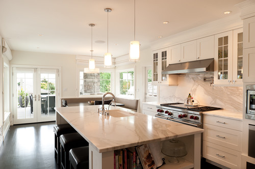
Island sink with light countertop
Stainless steel had been my go-to finish for sinks for many reasons, including its durability and availability at many price points. Then I realized it’s not always the best option, depending on the countertop’s finish, as well as the look you are trying to achieve. With a lighter countertop, a stainless steel sink may look like a dark hole in the island. A white sink, though, will not.
This article was originally written by Barbra Bright and appeared here. Note: The preceding is a guest contribution from Houzz, a leading platform for home remodeling and design.


Comment (0)